The critic, round 1
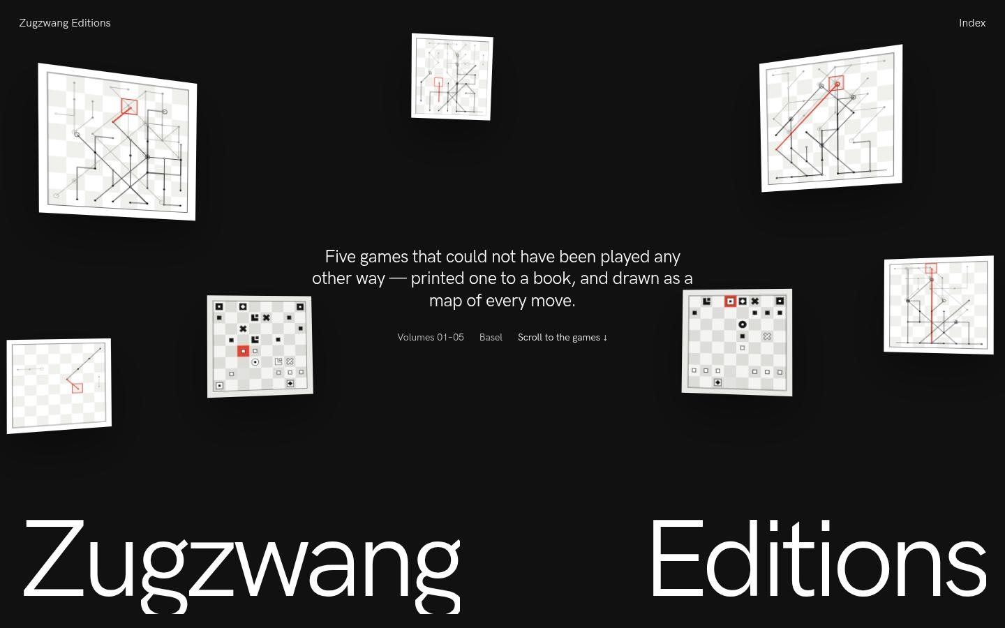
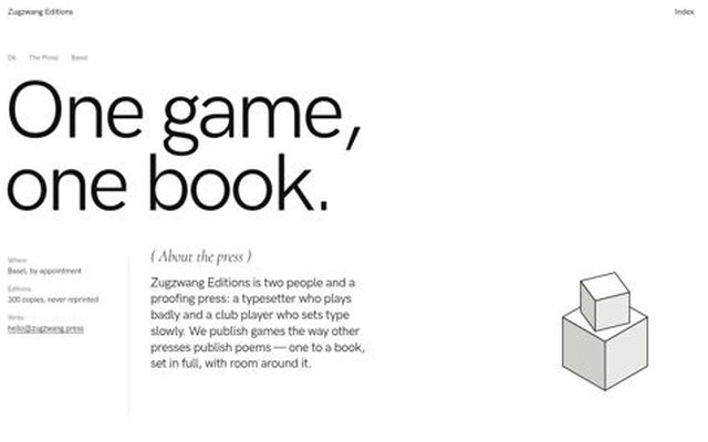
Zugzwang Editions follows squarespace-foundations closely where it counts: the #111 index with white chapter interiors, two-word chrome, a numbered "( Opera )" transport rail, a % loader and a giant "Opera →" next-chapter bookend. The twist really is a new idea. The chessboard curtain, the move maps that draw as you scroll and a difference square that rides the moves give the brand one engine and give the red one meaning. The reference puts one huge, lit object in the frame, and this site rarely does. The hero is small tilted thumbnails around 16px copy, and the method and ledger sections are pale, thin and mostly empty white. Mid-page craft slips too: the ledger rows sit greyed out at rest, a hover thumbnail is stuck over the header, and the right-hand move text is often caught blurred or half-faded. It is a solid, clever 7 that isn't yet a Site of the Day.
- Real concept-to-form fit: chess's black/white polarity is used as the backbone's polarity-as-wayfinding, and the difference square becomes 'the square under consideration'
- Chessboard curtain + 0%→100% counter loader reads clearly in the intro frames and is a genuine ownable signature
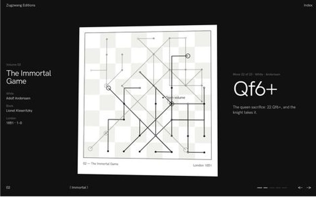
- Pinned chapter scene where each game's move map draws on scroll with a rolling SAN ticker (…Qe7, Qf6+, c4 in red); each game's art is visibly different
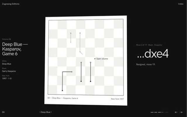
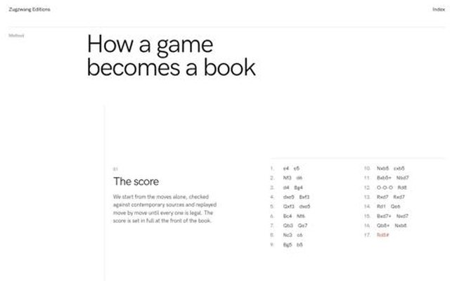
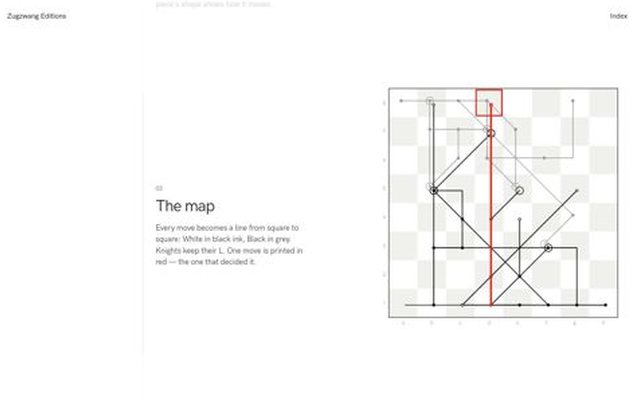
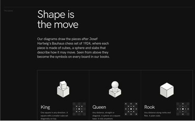

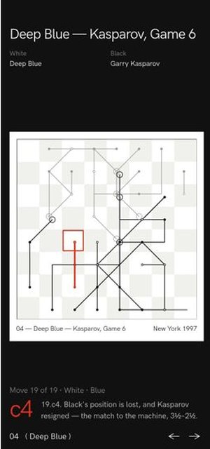
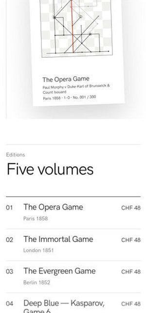
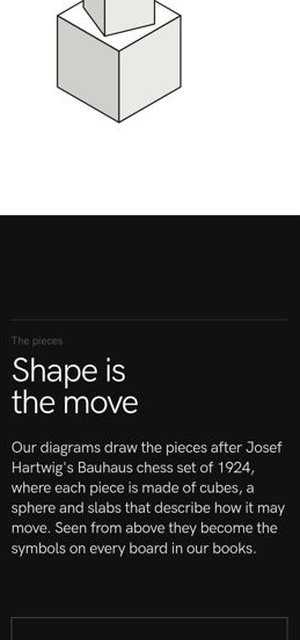
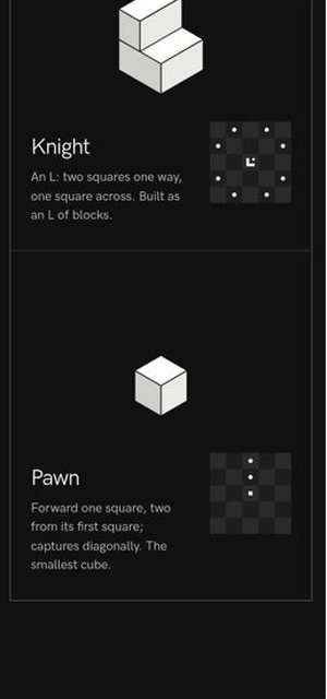
How it was madefree-rein subject: a Basel press that prints one historic chess game per book (Opera 1858, Immortal 1851, Evergreen 1852, Deep Blue–Kasparov G6 1997, Réti study 1921); one board engine (legal-move replayer + Hartwig/Bauhaus plan pieces + move-map line posters) draws every picture; 8×8 checkerboard closing = loader/route curtain with the backbone % Loading counter; red only on the decisive move; pinned 5-chapter home scene (maps draw by scroll, backbone difference square rides the moves, 64-square clip swap) + per-volume scroll replay with gliding pieces; header hides on scroll-down; all SVG for software Chromium; 17 recipes read, 16 ref images
Next project Tack & Halyard